OneView
2012
Overview
OneView is an internal CRM-like system that helps wealth advisers at First NZ Capital keep track of client information. Built in an Agile development environment with HTML5 and Angular.js, OneView aggregates content from the complex network of systems that store customer details.
I was responsible for the visual design, information architecture, user interface design and testing, as well as front-end development.
Background
About First NZ Capital
FNZC is a financial services company based in New Zealand. It’s a small but prestigious firm that has an alliance with the Credit Suisse Group, and it won Best Investment Bank - New Zealand at the World Finance Awards in 2013.
The concept behind OneView
The number of client information systems was spiraling out of control, so the company decided it needed a central hub that would offer a full picture of each client relationship. None of the pre-packaged CRMs were up to the task; they were too hard to plug into the existing infrastructure, unwieldy, and expensive. So the company made the decision to build internally, with the goal of developing a modern, browser-based solution that could perhaps be licensed out to similar companies in the future.
A team was assembled of two wealth advisers, five developers, and one UI designer: me. The wealth advisers would serve as liaisons representing the rest of the company’s wealth management team; the developers would build a solid groundwork and connect it to the data from all the old, incompatible systems; and I would take charge of the user experience and front-end.
Working with Agile
OneView followed an Agile development cycle, so there were no final product requirements declared at the outset of the project. We worked in roughly two-week iterations, each with their own deliverables that could be described in business language. This incremental approach allowed us to respond rapidly to user feedback.
Agile methods are well-suited to a user-first philosophy, but there are also design challenges associated with having no final requirements. I needed to approach the user experience holistically: working both with the developers and ahead of them, while keeping in mind a flexible vision of the end product.
Challenges
Communication with the wealth advisers was crucial, and I relied on tests and interviews to:
- identify their mental models of customer information, and quantify the data in meaningful ways
- understand their workflows when interfacing with clients
- determine the importance of efficiency for each task (efficiency was key for tasks done while on the phone with a client, for example)
Another challenge was the complicated permissions structure. Because of the sensitive nature of financial records, there were strict rules about what each employee could view.
The Process
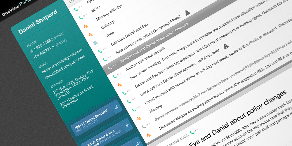
When I came on board, I started by wireframing a big picture vision of what the product might look like. This was a result of a pre-project list of possible features and in-depth talks with the advisers. Advisers thought of their clients in two ways: as people and as accounts. More than one person could be associated with an account, and more than one account could be associated with a person.
This indicated that client information needed to be split into separate Person pages and Account pages. Person pages would include links to the associated accounts, a list of basic identifying information, and a number of modules to quantify all additional data. The Account pages would be the same, except they would link to associated people.
Next, I wireframed the basic template for people and account pages, and then presented a number of visual design proposals. When one was selected, I built the platform with HTML5 on AngularJS. Because we had a defined user base all working with the same browser technology (IE8 with Chrome Frame), I was able to take advantage of emerging web standards. For example, the layouts used Flexbox.
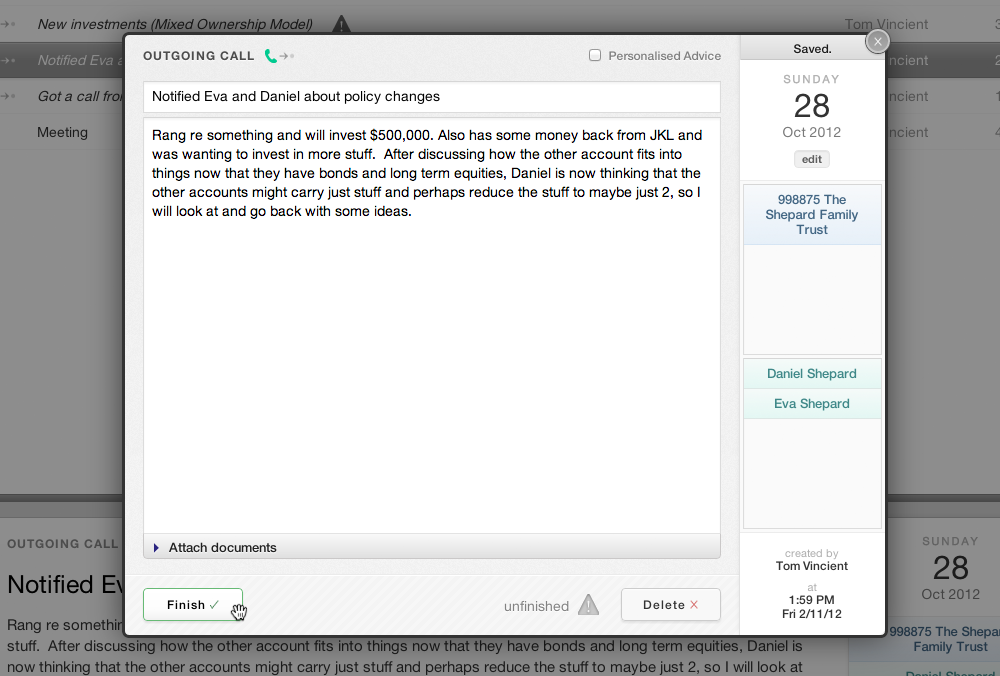
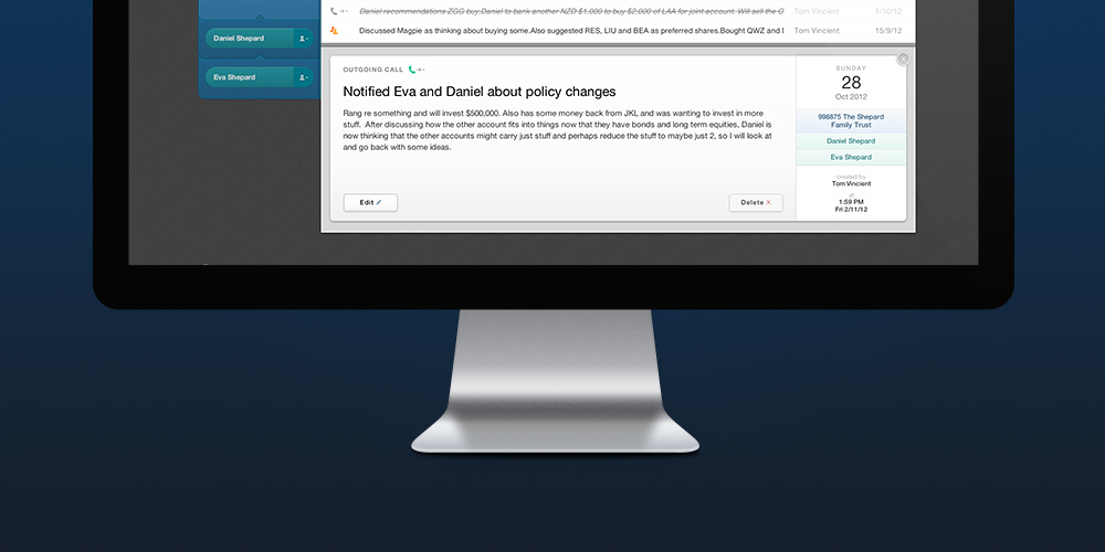
While the developers concentrated on pulling in all the people and accounts from the existing systems, the advisers requested that the next area of concentration should be a list of communications with each client. Communications included emails, phone calls, notes, and meetings. Certain types of communications (e.g. meetings) would be logged manually after they occurred. Other communications (e.g. emails) would be pulled from existing systems.
The result
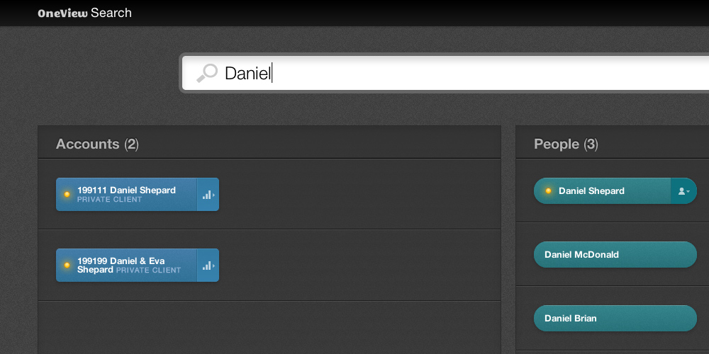
By the time I left, we had completed dynamic search functionality, a notifications system, both the people and account pages with basic information, and the communications module. The module included filter and search features, as well as a modal window to log new communications and edit old ones. Individual communications could be tagged with any number of people or accounts. They could also include a file uploaded from the local drive or network. This was the beginning of the document management system that the team would continue to develop.
OneView was a challenging, unique opportunity in a number of ways. The user base was small and defined. Many OneView tasks were repeated frequently over the course of a workday and needed to be optimized for efficiency. The team didn't want to use existing products as a template for OneView, so it was an opportunity for me to work within the Agile process to produce something new and perfectly suited for FNZC.