Learning & Development Start-up
2013
Overview
This small company was founded on the premise of providing a web-based resource for workplace training professionals, and was centered around a widely-adopted concept practiced in the learning and development community. To protect the company and its process, names have been withheld.
A systems architect and I were given three months to build the web app. I was responsible for the UX, visual design, and front-end development for everything behind the subscription-based paywall.
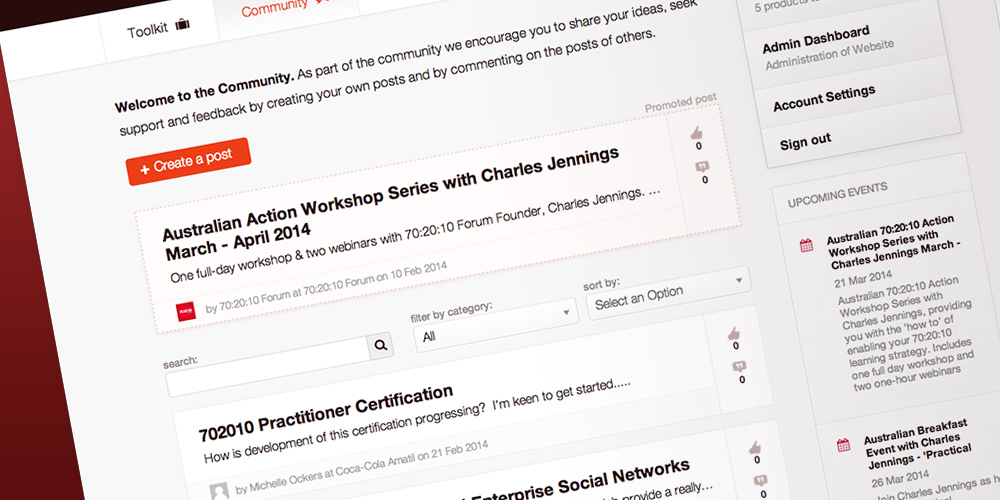
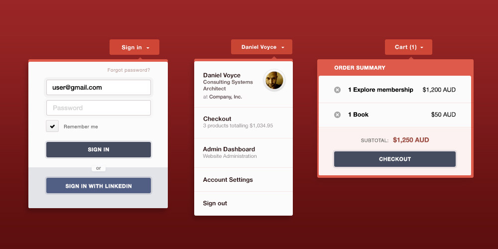
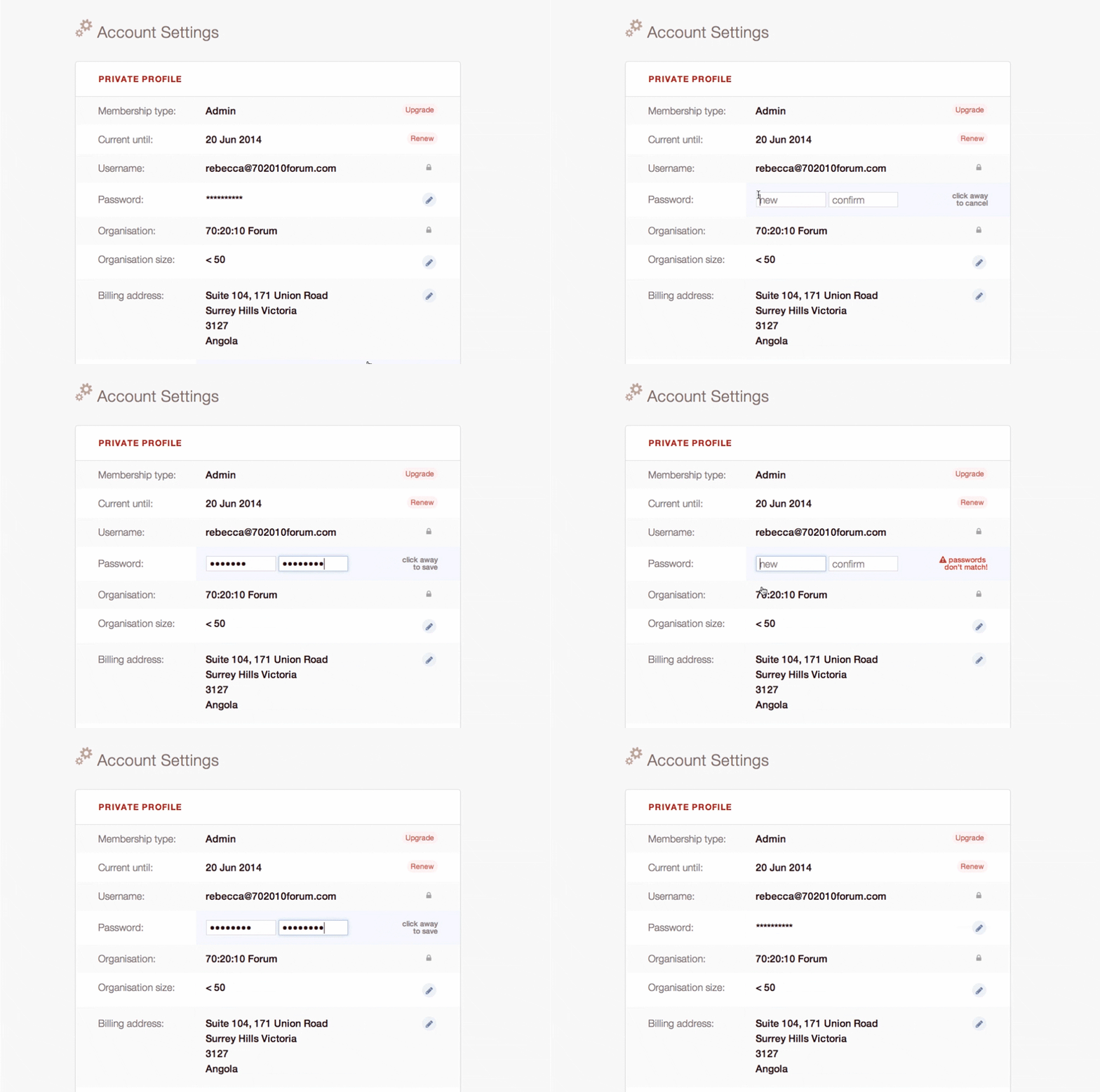
Components included a full checkout flow, an interactive community forum, a full suite of multimedia tools, notifications, and user profiles with inline editing functionality.
Requirements
I came on board a couple of months before the targeted launch date and inherited an Axure prototype from the previous UX designer. Two of us built the site: a systems architect and I. We worked with the product owners to decide which features from the prototype were essential for launch, and which could be cut and revisited later. We decided the initial release would have these five core components:
- a community forum
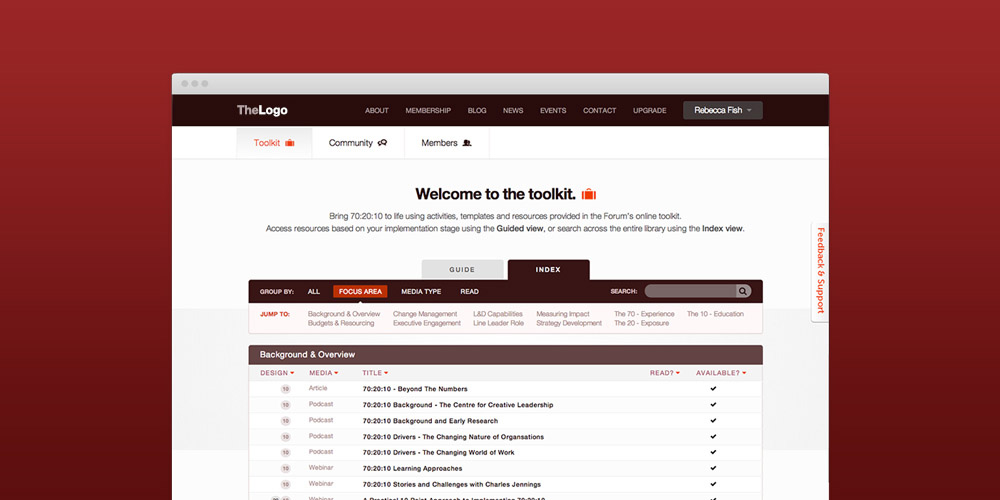
- a library of articles to help with implementation (the "Toolkit")
- a list of members and profiles
- personal account settings
- a signup/checkout flow
Project Details
UX
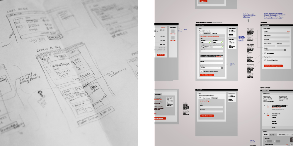
In wireframes and sketches, I addressed these areas of weakness in the prototype:
- There was no search, sort, or filter for either the Community section posts or the Toolkit articles. They had been ranked by number of likes only.
- There was unresolved functionality around the tiered membership model. Clear visual indicators of what was and was not accessible to members at each level of membership were needed.
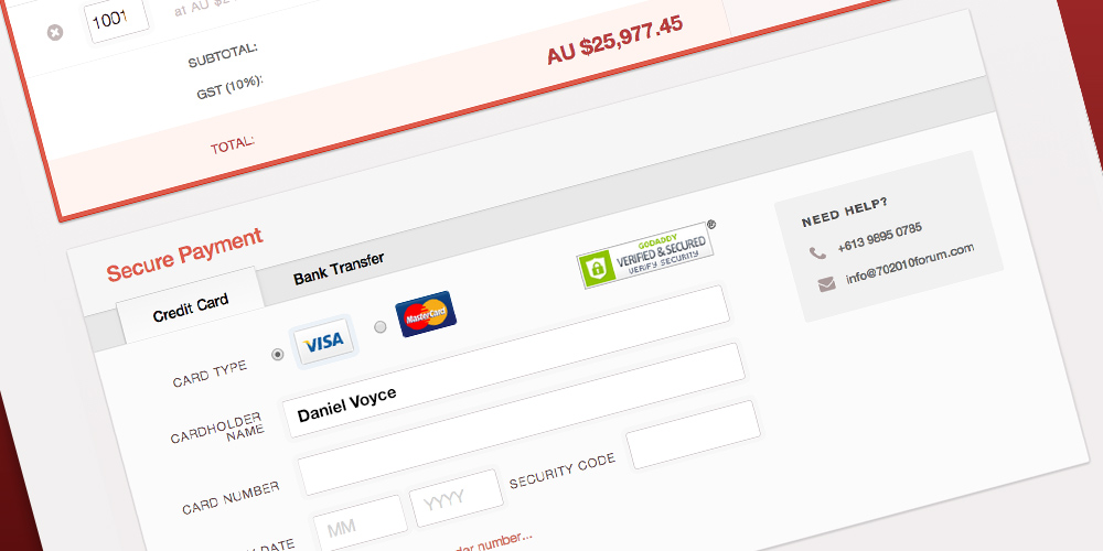
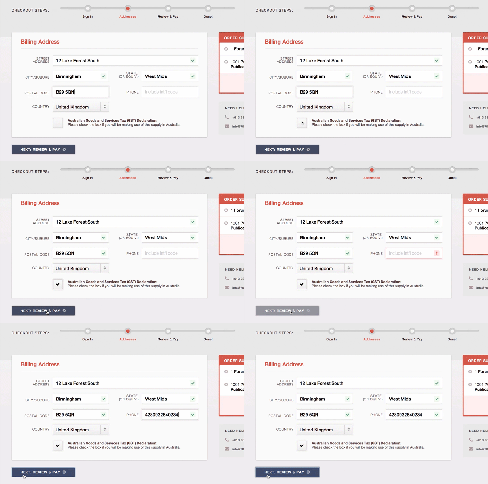
- There was no signup/checkout in the prototype. The Join functionality for the site had a few complexities: It needed to accommodate both sign-ups with variable pricing, as well as item purchases. It had to support signups through LinkedIn. And, it needed to address the currency and taxation complexities of international e-commerce.
To build the signup/checkout, I did a lot of competitive research and read literature on best practices. There was no budget or resources to recruit outsiders for usability testing, so I tested it on coworkers and friends: anyone who would sit still for me. The systems architect and I collaborated closely to build a system that was reliable and secure.
Visual design
A local graphic designer had already given the company a basic brand identity: the logo, Helvetica Neue, and true RGB 255,0,0 red. I presented a variety of designs for similar sites to the team, and we agreed on a minimal, clean interface so the content could be the star of the show. The final mockup felt light and friendly. I paid special attention to maintaining a visual hierarchy for each page.
Front-end development
The systems architect chose CakePHP for the web app framework, and wrote most of the controller functions. I was responsible for the view files: the HTML, LESS, and Javascript (mostly JQuery), and the database calls and array traversals.
One challenge we faced was browser demographics. The analytics on our “coming soon” splash page reported that IE had the biggest usage share—by far. This was mainly a result of the corporate appeal of our product. We decided to fully support IE8 and above, which would satisfy the vast majority of our users, without significantly hindering development speed.
After launch
The site had a soft release in June, and the response was positive. We started to hear from our customers: what they wanted more of, what they had trouble with. This feedback led to shifts in the business strategy. We introduced webinars and public events to great success. The tiered membership model was eventually abandoned, and replaced with a blanket organization-wide membership. Instead of requiring a sign up to access the free preview, we started offering it to the public.
A number of new or expanded features were added. I worked on refining the interactions, as shown below:
The latest
The company is still in early stages, working on finding its footing, but membership is growing well. In early 2014, I designed a new homepage, membership page, and ongoing art direction for the public-facing site.